
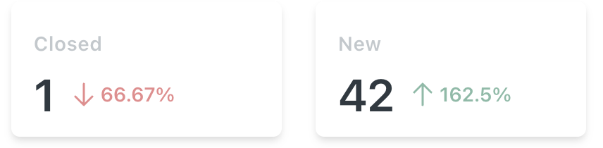
The down arrow ⬇️ indicates the decrease in performance, and the up arrow ⬆️ indicates the increase in performance compared to the ticket data with the current time range and the previous same time range.
For example, if you filter report data for "Last 24 hours," the last 24 hours' data will be compared with the previous 24 hours' data, and the change in percentage will be calculated.
Checking Reports summary
Go to Reports.
Click on All time button.
Choose the timeline, It will show the results according to the time line you have set.
Click on view details.